Intro
This redesign came from a clear problem, cPanel is a strong and recognizable product, but its website and dashboard felt outdated, repetitive, and hard to understand.
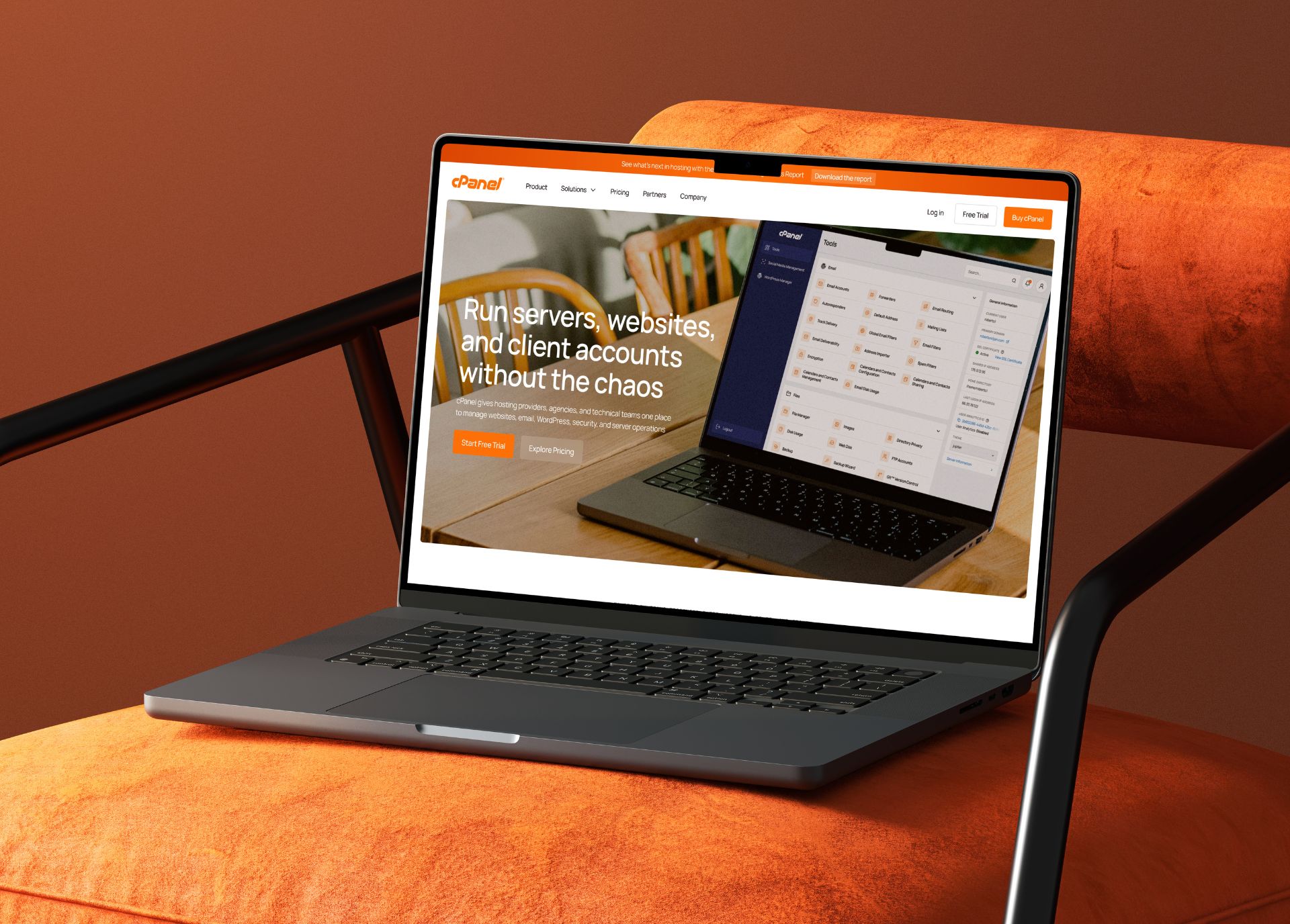
I wanted to refresh cPanel visually, but more importantly, use design to better reflect the quality of the product behind it.
The Problem
The biggest issue was a lack of focus.
On the homepage, too many elements were competing for attention at the same time, large icons were repeated across multiple sections, and some of the visuals felt more decorative than useful. The dashboard had a similar problem. It was functional, but visually cluttered and less clear than it should have been.
What I Changed
I reorganized the homepage to make it clearer and easier to understand. Repetitive sections filled with large icons were replaced with more relevant visuals, and I redesigned the “Who is cPanel for?” section using photography to give the page more human context and a less generic feel.
I also grouped the features into four clearer categories so the product would not read like one long, unclear list of capabilities. The testimonials were made more convincing by adding photos, logos, names, and job titles.
For the dashboard, I kept the recognizable color foundation, but modernized the icons, typography, and spacing so the whole interface would feel cleaner and more organized.
The Result
The final outcome is a clearer and more modern version of the existing experience.
The homepage now has better hierarchy, less repetition, and more focus. The dashboard keeps its familiar identity, but feels more modern and easier to use.